5 Tips for Creating an Incident Management Dashboard
Friday, November 24th, 2023
1. Know your target group
There are many potential target groups for Incident Management data. In addition to process performers and process management, this also includes middle and senior management as well as customers and users of the company’s products.
As a general rule, there should be one dashboard per role. Management needs a different view of the process than the Incident Management itself, and customers need a different perspective than hardware technicians.
2. Consider the recipient
After analyzing the target group, other fundamental factors come into focus: After the “Who?”, the “How?” needs to be answered.
In other words, it is a matter of imagining the recipient in the very moment of reading the report: Is the dashboard actively presented and the elements explained one by one? Will the report be read at a quiet desk or in a crowded elevator?
After answering these questions, it is clear how quickly the dashboard needs to be understandable and therefore how the metrics need to be prepared:
The more time available and the more concentrated the reading, the more information can be incorporated into the dashboard. Deep analyses and filter options, for example, should only be included if there is enough time for the recipient to use them.
3. Key figures, key figures, key figures
In the area of Incident Management, there is an almost unlimited number of useful metrics. Which ones are to be selected for the dashboard depends on many factors.
Together with the target group, the focus and the observation period are also determined. A strategic dashboard usually contains key figures for several months or years, while a tactical view contains a few weeks to a few months. Operational metrics usually only include data from a few hours to a few weeks.
We will share a small part of our most used metrics:
Strategic key figures:
- Medium and long-term trends of the overall incident process, including for example:
- Incident volume
- Response, reply and resolution times
- Resolution depth incl. first resolution rate
- Compliance with Service Level Agreements (SLA) and Operational Level Agreements (OLA)
- Trends in the allocation of CIs or services, including main centers of outages
- Consideration of changes to the process, e.g. change of service provider
Tactical key figures:
- Considerations of time periods around major events such as high-priority incidents or releases
- Representation of seasonal or other cyclical variations
- Use of issues to analyze and resolve common incidents
- Number of tickets in the current backlog by units
Operating key figures:
- Content of currently open tickets / backlog
- Tickets shortly reaching response, reply or resolution time
- Current open Problems for long-term resolution of Incident (-clusters)
- Current open Changes for the resolution of incidents
- Resolution depth
- Ticket volume by CI (for early detection of clusters)
The selection of the appropriate key figures is essential for the meaningfulness of the dashboard. Sufficient time should be planned for this step in order to be able to consider several variants.
4.Place within current reporting
After all content-related questions have been clarified, a final question needs to be answered:
Is this dashboard really needed?
Many companies already have similar or even identical reports that can be used with little effort. Likewise, some key figures or considerations may already exist in other dashboards. A detailed analysis of the existing reporting system is therefore particularly important for the long-term benefit of the dashboard.
If parts of the key figures are already used, it is quickly possible to check whether the existing report can be delivered to a larger target group. If not, the identical data source should be used in any case to avoid data-related inconsistencies and confusion.
5. Form follows function
The question of form is usually asked too early. This should only be considered after all the key figures have been selected, so as not to cause any compromises in terms of content.
Once all key figures have been defined, the question arises as to the sequence and form of presentation. There are three principles for this:
1. Display similar key figures close to each other
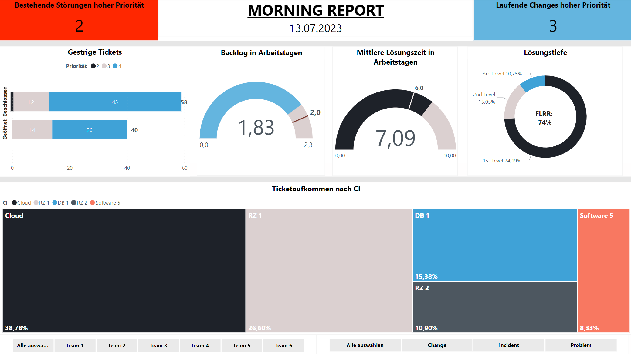
If a section of the process is to be illuminated from different sides, the key figures should be placed next to each other. The key figures for reaction time and response time form a logical block in the statement and should therefore also form a visible block in the display.
2. From critical to non-critical
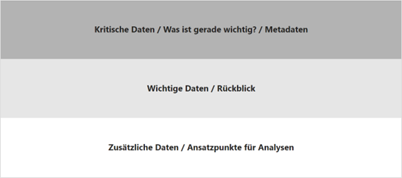
Particularly important key figures should be placed at the top left along the usual reading direction, while deeper analyses tend to be given a place at the end of the report. If something should come up while reading, the most important information will still be conveyed.
Elements without their own information, such as filter settings, should also be placed in the lower part.
3. Clear and distinct diagrams
Within the company, there is usually an unwritten law about what kind of diagrams are used for what use cases. Adhering to these conventions ensures that recipients quickly understand the content.
If such conventions do not yet exist, it makes sense to use elements that are as simple as possible. An element is ideal if no simpler one with the same expressiveness exists.

Patrick Heger
Author
Consultant


